Infographics help to break down complicated concepts into an easily digestible format. Instead of writing long definitions, you put the gist in a form that is easy to understand, save, and share.
This is why they can be highly effective in software house link building. If your infographics are done correctly, people are more likely to share them and link to you.
Software houses are no exception here; on the contrary, they can benefit greatly from using infographic-based link-building tactics.
So, how do you build links for your software house with infographics? Let’s find out!
Why Infographics Work So Well
You probably know what an infographic looks like. You see them everywhere, from blogs and online tutorials to brick-and-mortar stores and doctors’ offices. Why?
They are easy to understand for the general audience.
It is understandable that you want your software house content to be as detailed as possible – you’re showcasing your knowledge, after all.
But sometimes, this ends up being too much. This approach is fine for specialists looking for deep insights, but not every reader wants that level of detail. Within this group, there are your potential clients.
And that’s where infographics come in handy.These visuals transform your complex ideas into engaging, easy-to-follow stories. They are not just appealing but can also increase comprehension and retention among your audience.
Getting Started with Infographics for Software House Link Building
Before we get into the details of working on your infographics, we need to talk about the foundation: understanding your audience’s intent at different stages of their journey.
Let’s divide them using the common sales funnel:
| Funnel Stage | Description | Infographic Focus |
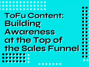
| ToFu (Top of the Funnel) | At this stage, your audience is just starting to recognize their needs or problems. They’re looking for general information, so infographics at this level should introduce broad concepts or solutions. | Introduce broad concepts or solutions. |
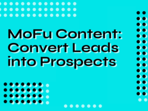
| MoFu (Middle of the Funnel) | Now, your audience has a clearer understanding of their problem and is exploring options. Infographics here can focus on comparing different solutions, outlining the benefits of specific technologies, or showcasing success stories. | Compare different solutions, outline the benefits of specific technologies, and showcase success stories. |
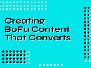
| BoFu (Bottom of the Funnel) | These are the decision-makers. They know what they need and are looking at specifics. Your infographics could highlight unique features, advanced techniques, or detailed case studies relevant to your software house. | Highlight unique features, advanced techniques, and detailed case studies. |
| Post-Purchase | After the sale, your goal shifts to keeping your customers engaged and satisfied. Infographics can play a role in this stage by offering tips for getting the most out of your product, updates on new features, or insights into the industry. | Offer tips for product usage, provide updates on new features, and share insights into the industry. |
This roadmap will guide you in creating purposeful infographics.
You’re not just producing content; you’re aiming for impact. You’re reaching your audience at the right time with the exact information they need.
Software houses differ slightly from other industries, as those funnel stages can intermingle more often.
For instance, an infographic created for the ToFu stage can also be the thing that turns a BoFu prospect into a customer. Technological solutions are complex, and a comprehensive infographic can be the clincher.
Define Your Target Audience
Knowing your ideal reader helps define the topics that should be discussed and the tone in which they should be presented.
For your software house, this will be a mix of software engineers and non-technical audience – but that’s just a guess.
To decide who you want to target with your infographics, you need to ask yourself a few questions (and back your answers with data!).
There are many frameworks that could help you with that. The StoryBrand framework is a popular choice.
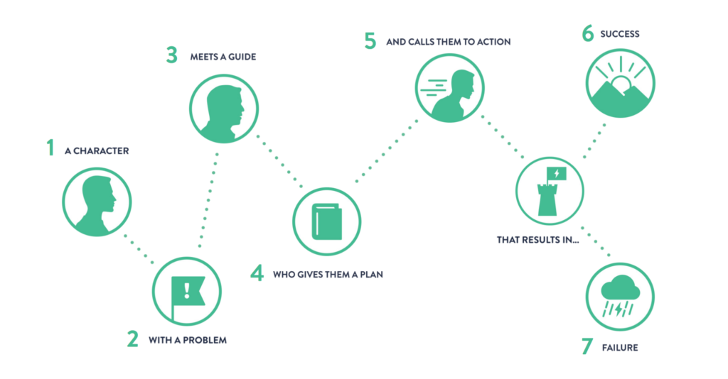


It divides the process into seven steps, each with questions that allow you to understand your potential clients better and learn how to help them!
Choose the Right Topics
Now that you know who your target audience – or potential clients – is and what their needs are, it’s time to figure out the ideal topics for your infographic content.
The easy way out is to present your target audience data to ChatGPT and ask for topic suggestions. But this tactic could mean cloning the content your competitors are already putting out there. And that won’t help you to stand out – at least unless you outdo them in every aspect possible.
Instead, look into the data you already have. Check the performance of your blog articles and see which topics do the best. Adding infographics for those could further increase their value!
Once you know what works with your audience, you can refine it. One method is to put a fresh spin on a popular topic. Or you could analyze a complex subject from a new angle with the goal of making it easier for your audience to understand.
Alternatively, you can research topics your potential clients may look for. AnswerThePublic is a great tool for this. You feed it a keyword related to your business, and it gives you a list of real, relevant questions people are asking online.
Whatever topic you choose, make sure it has enough depth so that viewers will find it engaging but not overwhelming; if there’s too much information included, they might lose interest before getting through all of it!
With an attractive infographic, you’re increasing your chances of creating something that will capture the attention of readers, be shared across different platforms, and generate backlinks to your website.
Prepare the Topic
Once you’ve selected the topic, it’s time to start researching. This includes collecting and verifying data from reliable sources and compiling it into a “knowledge base” you will use when working on the infographic itself.
Depending on the topic, you can try to include interesting facts, figures, or tips, as these draw readers in while providing valuable insights into the discussed topic.
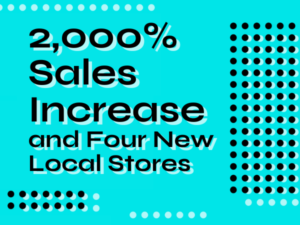
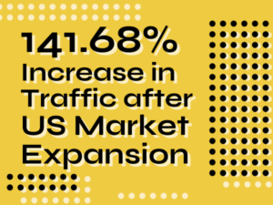
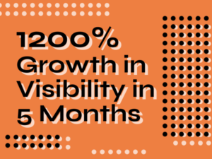
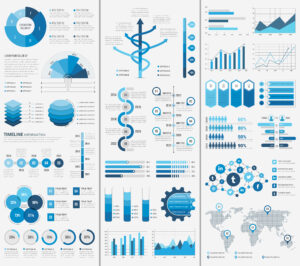
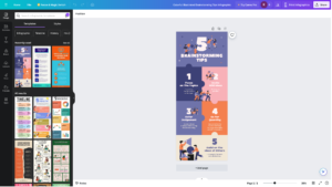
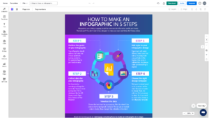
You should also look up relevant images or illustrations that support the visual elements of the infographic – these could range from graphs and charts to photographs or diagrams, based on what works best for each section of content. You can see some examples below:
Make sure all claims are backed by studies or surveys! This will increase your credibility and authoritativeness among your readers.
Only then can you be sure that you’re creating content that is both educational and entertaining (thus shareable), which is essential for any successful link-building strategy.
Draft the Infographic
With all of the research complete, it’s time to put together a draft layout for your infographic.
This includes deciding what sections should be included, how to divide sections into subsections, and which visuals will accompany each part.
You should consider using a few different formats – such as columns or timelines – for displaying data so that readers can quickly understand information without having to read through long blocks of text.
It may sound painful at first, especially if you don’t have much experience with visual data representation, but luckily, there are tools that can help you. Let’s take a look at a few of them:
Canva
Canva is a visual design tool packed with infographic templates that you can easily customize. It’s beginner-friendly, with drag-and-drop functionality and a vast library of graphics that lets you create visually appealing infographics quickly!
Venngage
Venngage is another widely used tool, an alternative to Canva focused specifically on presenting data. It has a lot of templates for infographics, flyers, diagrams, and more – all of those can be customized to fit your brand visuals. It’s also free and easy to use, making it a great tool for beginners.
Figma
Figma is a tool for more advanced users. It offers a large number of community templates. It gives you more control over the design so that you can fully customize the look and feel of your infographics to represent your brand best. It may take a while to get used to it, but the results are worth it.
Craft Your Infographic
Once the necessary research has been done and you have your initial draft, it’s time to start piecing together your infographic.
Aim to make your design vibrant and visually engaging while also ensuring it remains relevant and informative.
Every element of your design, from the typography to the color palette, should support your overall message and enhance the readability of your infographic.
Here are some more good design practices for your software house infographics:
- Be strategic when choosing an aesthetic. Recurring visual themes are great for reinforcing key ideas.
- Do not overcrowd your graphics. Leave plenty of white space so the viewer can easily focus on the most important information.
- Create well-organized sections. This will guide your viewer smoothly through the material and make complex concepts more digestible.
- Use visuals to break up large chunks of information. A combination of bullet points, charts, diagrams, and icons can be used to highlight key points succinctly.
Remember, creating an effective infographic is not just about making it look nice. It’s about presenting complex information in a clear, concise, and visually appealing manner that’s easy for your audience to understand and engage with.
When your infographic can achieve this, it becomes a valuable resource that others will want to share – and that’s when you start gaining backlinks!
Promotion and Link Building
Once your infographic is ready, it’s time to put it out into the world.
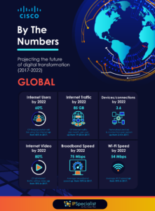
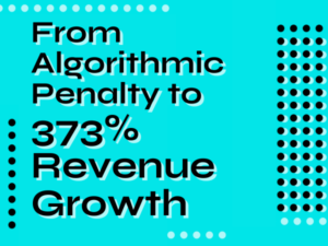
Here’s another example of a well-executed infographic.
It leverages contrasting colors to attract attention to specific parts of the page – such as the title, the GLOBAL mark, and each of the six statistics mentioned.

Publish Your Infographic
The first step is to upload the infographic to your website.
You can create a new page or write a blog post. The infographic should be accompanied by a short description that provides an overview of the content and its key points.
You may also want to include a link to the infographic so that viewers can easily access it directly. This is especially useful for those who might not be able to view the whole thing on the page due to limited screen space or slow internet connections.
Then, optimize the page for search engines. This includes adding relevant keywords to the article text as well as the page title and meta description and including the infographic in any applicable categories.
Share and Promote Your Infographic on Social Media
Once the infographic is live on your website, it’s time to share it on social media.
Take the time to craft an engaging post that will draw viewers’ attention and encourage them to click through. You should also use hashtags relevant to the topic to help your post reach a wider audience and increase the chances of it being shared.
You may invest in paid ads or sponsored posts to get your infographic in front of more people. The more people see your infographic, the more likely you are to get shares and backlinks.


Reach Out to Influencers and Other Websites
Another way to get links to your infographic is to reach out to influencers and other websites.
Start by compiling a list of potential websites and influencers who have a large following and would be interested in sharing your content.
Then, research their websites to get an idea of the kind of content they typically share and how you can best approach them.
Keep in mind that this is a time-consuming process and will require some effort to make sure the outreach is successful.
Offer something of value in return, such as a free trial or discount code, and be sure to provide a link to the infographic so they can view it before deciding whether or not to share.
You can also join appropriate forums or comment on blog posts related to the subject and include a link there. This is a great way to get your content in front of people who might not have seen it otherwise.
Find Relevant Directories
Lastly, you can submit your infographic to directories such as Visual.ly, Slideshare, and Infographic Journal.
These directories provide a platform for people to share their infographics and get links back to their websites. Many also have a feature for viewers to share the infographic on social media, increasing their reach and the chances of generating backlinks.

Monitor Your Progress
Monitoring your link building progress is essential for obtaining meaningful insights.
This could involve measuring how many people are visiting the page hosting your infographic and where they come from, for example, social media sites or directories.
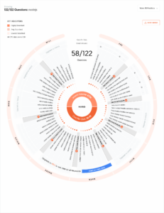
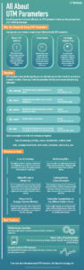
It can be easily done using UTM tags – and the infographic from Terminus on the right is a great starting point (click on it to see full resolution).
You should also be aware of who has shared it and what kind of content accompanies such shares; this will give you an idea of which platforms generate more backlinks and views so you can focus on those going forward!
Additionally, keep an eye out for any mentions that might not have been tracked automatically by analytics tools since these may lead to even more quality links being generated.
Valuable tools for monitoring these metrics include Google Analytics, Ahrefs, or more comprehensive marketing tools such as Brand24. They provide comprehensive data about who is linking to your content as well as other useful information that can be used for optimizing future campaigns.
Wrapping Up
Building links using infographics is more than just mastering your content and design.
It’s a process that starts with knowing your audience, narrowing down the right topics, and creating a well-researched, eye-catching infographic. Having done that, you can start promoting your new asset.
Take each step at your own pace and focus on delivering value to your audience. Through this process, you not only enhance visibility and reputation but also increase leads.
Remember, the purpose of infographics is to clarify complex information – regardless of whether you’re talking to industry experts or non-tech-savvy clients.
So, keep it clear, engaging, and useful. When done right, your efforts are bound to pay off. Start planning, and see your software house grow!


![Google March 2024 Core Update: What we know so far? [Don’t Panic]](https://non.agency/wp-content/uploads/2024/03/google-march-2024-core-update--300x225.png)